Opponent Process Theory: How Colors Shape Your Perception
The Core Definition of Antagonistic Colors
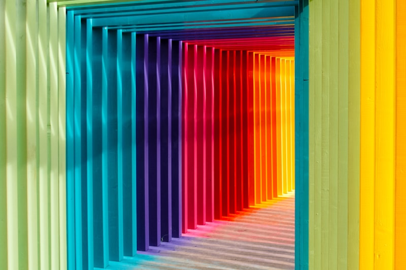
Antagonistic colors, fundamentally rooted in the field of visual perception, are defined as pairs of colors that are directly opposite one another on the traditional color wheel. These pairings—such as red and green, blue and yellow, or black and white—create the highest possible contrast when placed side-by-side, leading to a phenomenon often described as visual vibration or intense saturation enhancement. The term “antagonistic” highlights the mutually exclusive nature of these colors; psychologically, the presence of one color signal strongly inhibits or suppresses the perception of its opposite, a principle central to how the human visual system processes light and color information. This concept moves beyond simple aesthetics, providing critical insight into the neural architecture underlying our experience of hue, lightness, and saturation.
The core mechanism hinges on the fact that when two antagonistic colors are mixed subtractively (as with paint), they tend to neutralize each other, often resulting in a neutral gray or black. However, when viewed additively (as with light or side-by-side placement), they amplify each other’s presence, making both appear more brilliant and intense. This intense contrast is not merely an artistic choice but a reflection of how the sensory input is processed by specialized neural circuits. Understanding antagonistic color pairs is essential for grasping the limitations and capabilities of the human eye in distinguishing and interpreting the vast spectrum of visible light, confirming that color is as much a function of the brain as it is of physics.
The Opponent-Process Mechanism
The true psychological foundation of antagonistic colors is explained by the Opponent-Process Theory of color vision. This theory posits that the human visual system interprets color information by processing signals in an antagonistic manner through three key opponent channels: the red-green channel, the blue-yellow channel, and the black-white (lightness) channel. Each channel works based on inhibition, meaning that neural activity signaling the presence of ‘red’ simultaneously inhibits the signal for ‘green,’ and vice versa. This is why it is physically impossible to perceive a color that is simultaneously reddish-green or yellowish-blue.
The theory asserts that specialized cells, such as retinal ganglion cells and neurons in the lateral geniculate nucleus (LGN), are wired to fire in response to one specific color wavelength and decrease their firing rate in response to its antagonistic counterpart. For example, a cell might be designated as a “+Red / -Green” cell. When red light hits the retina, the cell is stimulated; when green light hits it, the cell is inhibited. If both red and green light hit the retina simultaneously, the signals cancel each other out, leading to a neutral perception. This complex neural wiring explains the dramatic visual effects observed when complementary colors are presented together, as the respective signals intensely compete for neural dominance, resulting in the characteristic “vibrating” effect mentioned by designers.
Historical Context and Scientific Origin
The concept of antagonistic colors, while utilized intuitively by artists for centuries, received its formal scientific grounding in the late 19th century, primarily through the work of German physiologist Ewald Hering (1834–1918). Hering proposed the Opponent-Process Theory in 1878, challenging the prevailing Young-Helmholtz Trichromatic Theory, which suggested that color vision resulted solely from the mixing of three primary cone types (red, green, and blue). While the Young-Helmholtz theory accurately described the function of the photoreceptors (cones) in the retina, it failed to fully explain certain perceptual phenomena, such as color blindness patterns and, crucially, the generation of negative afterimages.
Hering’s model provided the necessary mechanism to bridge the gap between initial light reception and final conscious color experience. He observed that people often describe color sensations in terms of opposing pairs (red vs. green, blue vs. yellow) and noted that prolonged exposure to one color always resulted in the perception of its antagonist when the stimulus was removed. This observation led him to theorize that processing occurs not just at the level of three receptor types, but via subsequent neural stages that organize these signals into antagonistic pairs. Hering’s theory was initially met with skepticism but was ultimately confirmed by physiological evidence in the 1950s and 1960s through electrode studies that identified the specific opponent-process neurons in the visual pathway.
Practical Example: The Phenomenon of Afterimages
One of the most compelling demonstrations of the antagonistic color system at work is the negative afterimage phenomenon. This common psychological experience occurs when a person stares intently at a highly saturated color and then shifts their gaze to a neutral background, such as a white wall. The resulting image perceived is not the original color, but its exact antagonist. This effect is a direct consequence of the fatigue and subsequent rebound of the opponent-process channels.
The mechanism involves the overstimulation of the neural pathway responsible for the perceived color. When the eye is focused on a vibrant red object, for example, the “+Red / -Green” channel is maximally stimulated for an extended period. This intense activity causes the neural receptors to become fatigued or desensitized. When the gaze shifts to a neutral white surface (which contains equal amounts of all colors), the fatigued ‘Red’ component temporarily ceases to fire normally, while the ‘Green’ component of the pair, which was previously suppressed, rebounds with relatively stronger activity. Consequently, the neutral input is momentarily interpreted as green—the antagonistic color to red—until the system rebalances itself.
To illustrate this psychological principle clearly, the following steps detail the process:
- Stimulus Presentation: Focus intensely on a highly saturated image composed primarily of one color, such as a bright yellow circle, for thirty to sixty seconds without blinking. The blue-yellow opponent channel is being heavily utilized, with the yellow signal dominating and suppressing the blue signal.
- Neural Fatigue: During this prolonged exposure, the neurons responsible for processing the yellow signal become temporarily exhausted, leading to a diminished capacity to fire normally.
- Gaze Shift: Immediately shift the gaze to a blank, white surface. White light contains all colors equally, providing a neutral input.
- Rebound Effect: Because the yellow receptors are fatigued, the previously suppressed blue signal within the blue-yellow channel temporarily dominates the input. The visual system perceives the antagonistic color, blue, as a ghostly afterimage until the neural balance is restored.
Significance in Visual Psychology and Design
The study of antagonistic colors holds profound significance, bridging the gap between basic sensory physiology and applied fields like art, design, and clinical psychology. In fundamental psychology, the confirmation of the Opponent-Process Theory provided a necessary refinement to the understanding of color constancy and how the brain filters sensory information to create a stable, reliable perception of the world. It demonstrated that color processing is not a passive reception of light waves, but an active, interpretative process involving complex neural computations that maximize contrast and clarity, allowing us better discrimination between subtle hues.
In applied contexts, the principle is crucial for understanding visual fatigue and contrast optimization. For instance, in interface design, using antagonistic colors for text and background (e.g., strong blue text on a strong yellow background) can maximize perceived contrast but may also induce rapid eye fatigue due to the intense neural competition they create. Conversely, understanding these pairs allows artists and advertisers to deliberately create visual tension, drawing the viewer’s attention forcefully to specific elements through the inherent vibrancy that antagonistic pairings generate. This knowledge informs decisions in fields ranging from safety signage (where high-contrast antagonistic pairs like red/green or yellow/purple are often used) to sophisticated color grading in cinematography.
Real-World Applications and Impact
The practical impact of antagonistic color principles extends far beyond simple aesthetics, influencing critical areas of human behavior and technology. In modern textile and fashion design, the strategic use of complementary colors is employed to ensure that garments stand out or to create optical illusions of volume or separation, capitalizing on the visual vibration effect. Similarly, in interior design, an antagonistic accent wall can be used to dramatically define a space, creating a focal point that stimulates the eye and affects the perceived temperature and mood of a room.
Beyond traditional design, antagonistic color knowledge is vital in the development of sophisticated display technologies. Engineers must account for the limitations and biases of the opponent channels when calibrating screens and lighting systems to ensure accurate color reproduction and minimize user discomfort. Furthermore, in clinical settings, understanding color antagonism is sometimes relevant in diagnosing certain types of acquired color deficiencies or monitoring retinal health, as damage to specific opponent channels can alter how these pairs are perceived. The principles inherent in these color relationships are a constant reminder that our experience of light is actively constructed by the neurological framework of visual perception, rather than simply being a passive reflection of the environment.
Connections to Related Psychological Concepts
Antagonistic colors are deeply interwoven with several broader concepts within sensory and cognitive psychology. Most notably, they are closely linked to the phenomenon of Simultaneous Contrast, where the appearance of a color is altered by the presence of surrounding colors. When a neutral gray patch is placed next to a strong red field, the gray patch will appear faintly greenish, demonstrating the inhibitory effect of the red signal on the adjacent visual field’s green processing pathway. This effect further reinforces the dominance of the antagonistic processing system in determining how we interpret local color information.
The study of antagonistic colors falls squarely within the subfield of Sensory Psychology or Psychophysics, which examines the relationship between physical stimuli (light wavelengths) and their subjective perception (color experience). Furthermore, the concept relates directly to the study of Chromatic Adaptation, which is the temporary change in color sensitivity of the visual system after prolonged exposure to colored stimuli, the mechanism responsible for the negative afterimage. The knowledge derived from antagonistic color research is fundamental to all subsequent studies in color vision, forming the crucial intermediary stage between the primary light absorption by the cones and the higher-level processing carried out in the visual cortex, thereby underpinning much of what we know about human visual perception.