Color Psychology: How Bold Hues Influence Your Mind
- The Concept of Visually Prominent Color
- Defining “Bulky Color” in Psychological Context
- Historical Perspectives on Color Psychology and Prominence
- Empirical Evidence: Attention and Cognitive Processing
- Empirical Evidence: Mood Regulation and Affective Responses
- Empirical Evidence: Memory Encoding and Retrieval
- Practical Applications and Real-World Examples
- Theoretical Frameworks and Underlying Mechanisms
- Connections to Broader Psychological Theories
- Future Directions and Concluding Thoughts
The Concept of Visually Prominent Color
In the vast and intricate field of color psychology, researchers have long explored how different hues and their properties influence human perception, emotion, and behavior. While much attention has been given to specific colors like red, blue, or green, an emergent area of inquiry focuses on the intrinsic visual characteristics of colors that transcend mere hue. The term “bulky color,” as employed in specific research contexts, refers to colors that possess a significant visual presence or weight, often characterized by high saturation, intensity, or the physical area they occupy within a visual field. These colors are not necessarily defined by their specific wavelength but rather by their capacity to command attention and evoke strong psychological responses due to their visual prominence. This characteristic distinguishes them from more subdued or neutral colors, positioning them as powerful stimuli in various cognitive and affective processes.
The investigation into what constitutes a “bulky color” and its effects stems from a recognition that visual stimuli are not merely passively observed but actively processed by the human brain, leading to a cascade of physiological and psychological reactions. Such colors are theorized to engage perceptual mechanisms more intensely, potentially due to their higher contrast against backgrounds or their innate ability to draw the eye. Understanding this phenomenon is crucial for fields ranging from environmental design and marketing to therapeutic interventions, where the strategic deployment of color can profoundly impact user experience and behavioral outcomes. The underlying principle suggests that certain visual attributes of color, beyond their chromatic identity, play a fundamental role in shaping our interaction with the environment and our internal states.
This encyclopedia entry will delve into the concept of what the original research referred to as “bulky color,” interpreting it as a descriptor for visually prominent or impactful color stimuli. We will explore its definition, historical underpinnings, empirical evidence supporting its influence on attention, mood, and memory, practical applications, and its relationship to broader psychological theories. By examining the findings of key studies, such as those by Küller et al. (1998) and Järvenpää (2005), we can gain a deeper appreciation for the subtle yet profound ways in which the visual weight of color shapes our daily lives and cognitive functions.
Defining “Bulky Color” in Psychological Context
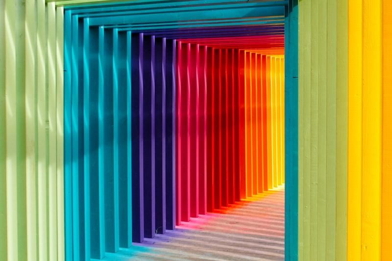
Within the specialized studies that introduced the concept, “bulky color” describes a category of colors identified by their significant visual impact rather than a specific hue or saturation level in isolation. While not a universally standardized term in general psychology, it serves as a descriptor for colors that are visually dominant, possess a certain “weight” or “presence,” and are often characterized by high saturation, brightness, or the large spatial extent they cover. For instance, a highly saturated red occupying a large portion of a visual field might be considered a “bulky color” due to its ability to capture and sustain attention. This definition moves beyond simple color categorization to focus on the experiential and perceptual qualities that make a color salient and influential.
The key idea behind “bulky color” is rooted in the understanding that visual stimuli vary in their ability to elicit strong responses. Colors deemed “bulky” are thought to trigger more robust cognitive and affective processing because of their inherent visual prominence. This prominence can be due to a combination of factors: higher chroma (saturation), greater luminance (brightness), or simply the sheer area they cover. The mechanism posited is that these visually arresting qualities lead to an amplified sensory input, which in turn demands more cognitive resources and can provoke stronger emotional or physiological reactions. It’s a concept that highlights how the physical properties of light, when perceived as color, can actively shape our psychological landscape.
In the context of the foundational research by Küller et al. (1998) and Järvenpää (2005), “bulky colors” were empirically observed to enhance various human behaviors, including increased attention, improved mood, and heightened memory recall. Although the precise parameters defining “bulky” were operationalized within these studies (e.g., through specific color palettes with high saturation or significant visual area), the consistent findings across these domains underscore the importance of considering the visual impact or “weight” of colors in psychological investigations. This approach invites a more nuanced understanding of color perception, moving beyond simple hue associations to explore the dynamic interplay between color characteristics and human psychological states.
Historical Perspectives on Color Psychology and Prominence
The study of color’s influence on human behavior has a rich history, dating back to ancient civilizations that attributed symbolic and therapeutic properties to various hues. Philosophers like Goethe and artists through the centuries have mused on the emotional and psychological power of color. However, the scientific study of color perception and its psychological effects truly began to formalize in the late 19th and 20th centuries. Early psychological research focused on basic color associations, preferences, and the physiological responses to different wavelengths of light. This foundational work laid the groundwork for understanding how color stimuli are processed by the visual system and interpreted by the brain.
As the field of environmental psychology developed, researchers began to explore how color in built environments could affect mood, productivity, and well-being. This era saw an increased interest in the practical applications of color theory in architecture, interior design, and urban planning. Studies moved beyond simple preference to examine the impact of color on cognitive tasks, stress levels, and social interactions. It was within this context of comprehensive color research that the more specific inquiry into characteristics like “visual prominence” or “bulkiness” emerged, seeking to understand not just which colors affect us, but how certain visual qualities of color amplify these effects. The work of Küller and Järvenpää, situated in this tradition, aimed to isolate and measure the impact of such visually impactful colors on specific cognitive and affective outcomes.
The research conducted by Küller et al. (1998) and Järvenpää (2005) marked a significant step in identifying that specific visual characteristics, referred to as “bulky color,” could elicit distinct behavioral responses. Their studies contributed to a growing body of evidence that color is not merely a decorative element but a powerful psychological tool. This period of research moved towards a more empirical and quantitative understanding of color’s influence, employing controlled experiments to measure effects on attention, mood, and memory. By focusing on the visual “weight” or “prominence” of colors, these researchers highlighted a dimension of color psychology that emphasizes the intensity and salience of visual stimuli, paving the way for further investigations into the mechanisms behind these observed effects.
Empirical Evidence: Attention and Cognitive Processing
One of the most compelling findings concerning “bulky color” is its demonstrable effect on attention and subsequent cognitive processing. The human visual system is constantly bombarded with stimuli, and our ability to selectively attend to relevant information is crucial for survival and effective functioning. Research indicates that colors with high visual prominence are particularly adept at capturing and holding attention, making them powerful tools for guiding focus. A seminal study by Küller et al. (1998) provided robust evidence for this, showing that participants exposed to environments featuring “bulky colors” exhibited increased attention to task-relevant stimuli. This effect was notably pronounced when the “bulky color” was a reddish hue, suggesting a potential interaction between the inherent properties of certain hues and their visual weight.
Further corroborating these findings, Järvenpää (2005) conducted research that similarly highlighted the attentional benefits of “bulky colors.” Participants in environments with these prominent colors were found to be more engaged and less distractible, indicating an enhanced ability to focus on the task at hand. This heightened attention is not merely a transient flicker of interest but appears to facilitate deeper cognitive engagement, allowing individuals to process information more effectively. The mechanism is believed to involve the activation of brain regions associated with salience detection and executive control, where the visually impactful nature of the color acts as a strong signal, prioritizing its processing over other less prominent stimuli. This has profound implications for environments where sustained attention is critical, such as educational settings or complex operational control rooms.
The enhanced attentional capture by “bulky colors” can be attributed to several factors. Firstly, highly saturated or visually dominant colors often create a stronger contrast with their surroundings, making them stand out more readily. Secondly, certain colors, particularly those in the red-orange spectrum, are known to have evolutionary significance, triggering an alert response that can naturally draw and maintain focus. When these chromatic properties are combined with a “bulky” visual presence, their power to command attention is amplified. This suggests that the impact on attention is not simply a matter of color preference but a deeper, possibly innate, response to visually potent stimuli, leading to improved cognitive resource allocation and overall task performance.
Empirical Evidence: Mood Regulation and Affective Responses
Beyond their influence on cognitive functions, “bulky colors” have also been significantly linked to the regulation of mood and the elicitation of specific affective responses. The emotional impact of color is a well-documented area within psychology, with various hues often associated with particular feelings or states. However, the concept of “bulky color” introduces an additional dimension, suggesting that the visual prominence or intensity of a color can amplify or modify these emotional reactions. Järvenpää’s 2005 study provided key insights into this phenomenon, demonstrating that participants exposed to “bulky colors” reported feeling more positive compared to those in environments with neutral colors. This indicates that such colors can actively contribute to a more optimistic or pleasant emotional state.
In a parallel vein, Küller et al. (1998) found that exposure to “bulky colors” was associated with participants reporting feelings of greater relaxation. This seemingly counter-intuitive finding, especially if “bulky” implies high energy, suggests that the impact on mood is nuanced and context-dependent. It might be that in controlled settings, the consistent and visually stable presence of a “bulky color” can create a sense of groundedness or security, leading to a feeling of calm. Alternatively, the positive aesthetic experience of observing visually rich colors could contribute to a general sense of well-being and reduced stress, thereby promoting relaxation. These studies collectively underscore the capacity of visually prominent colors to modulate emotional states, moving individuals towards more positive or relaxed dispositions.
The mechanism through which “bulky colors” influence mood is likely multifaceted. It could involve direct physiological responses, where certain colors stimulate the autonomic nervous system in ways that impact hormone levels or brain activity associated with emotion. Furthermore, cultural associations and individual experiences with colors play a role, but the consistency of findings across studies suggests a more fundamental, possibly universal, aspect to the impact of visual prominence. The robust and commanding nature of “bulky colors” may simply be perceived as aesthetically pleasing or stimulating in a non-threatening way, leading to an uplift in mood or a sense of calm engagement rather than arousal or agitation. This makes them valuable considerations in therapeutic environments, public spaces, and personal living areas where emotional well-being is a priority.
Empirical Evidence: Memory Encoding and Retrieval
The influence of “bulky colors” extends significantly into the realm of memory, affecting both the encoding of new information and the retrieval of previously stored memories. Our ability to recall details is often enhanced by cues present during the initial learning phase, and color has long been recognized as a potent contextual cue. However, the research on “bulky colors” suggests that the visual prominence of a color can further amplify its mnemonic power. Järvenpää’s 2005 study explicitly demonstrated this, finding that participants exposed to “bulky colors” were notably more successful in remembering specific details of a task compared to those in environments with neutral colors. This implies that the rich visual input provided by “bulky colors” creates more distinctive and robust memory traces.
Complementing these findings, Küller et al. (1998) also reported that individuals exposed to “bulky colors” performed significantly better on various memory tasks. This enhanced performance can be attributed to several factors. Firstly, the increased attention elicited by “bulky colors” during the encoding phase means that information is processed more deeply and elaborately. Deeper processing leads to stronger memory formation. Secondly, the distinctiveness of “bulky colors” can serve as a more effective retrieval cue. When the environment or stimuli associated with a memory are highly salient and unique, they provide a stronger signal for recalling that information later. Thus, the visual “weight” of these colors acts as a powerful enhancer for both the initial learning process and the subsequent ability to access stored knowledge.
The underlying mechanisms for improved memory recall with “bulky colors” are likely tied to their ability to create more vivid and emotionally charged experiences. Research in cognitive psychology suggests that memories associated with strong emotional or perceptual salience are more easily remembered. “Bulky colors,” by their very definition, are designed to be visually impactful, and this impact can translate into a more memorable experience. Furthermore, the enhanced attention observed in the presence of these colors ensures that the information is thoroughly registered in working memory before being consolidated into long-term memory. This dual effect of improved encoding and more effective retrieval cues positions “bulky colors” as a powerful, albeit subtle, tool for cognitive enhancement in educational contexts, information display, and advertising.
Practical Applications and Real-World Examples
The empirical findings on “bulky colors” have significant practical implications across various domains, offering actionable insights for designers, educators, marketers, and therapists. Recognizing that visually prominent colors can enhance attention, improve mood, and boost memory recall provides a powerful toolkit for influencing human behavior in a positive and constructive manner.
- Educational Settings: In classrooms or learning environments, strategic use of “bulky colors” could improve student engagement and retention. For instance, creating a feature wall in a vibrant, highly saturated color in a study area could help students maintain focus during independent work. Visual aids, such as charts or diagrams, that incorporate “bulky colors” for key information could make complex concepts more memorable. A teacher might use a projector slide with a prominent, rich red background for a crucial definition, ensuring students pay heightened attention and are more likely to recall that specific piece of information during an exam.
- Marketing and Advertising: Brands can leverage “bulky colors” to make products or advertisements more attention-grabbing and memorable. A product display featuring packaging with a large, intensely colored logo would naturally draw the eye amidst competing items. Similarly, a website or app interface using “bulky colors” for call-to-action buttons (e.g., “Buy Now,” “Sign Up”) would increase user engagement and click-through rates, as these elements would stand out and be more easily remembered later. The emotional uplift associated with such colors could also foster a more positive brand perception.
- Therapeutic and Healthcare Environments: The mood-enhancing and relaxation-promoting effects of “bulky colors” can be harnessed in healthcare settings. Waiting rooms or patient recovery areas decorated with visually prominent but calming colors (e.g., a deep, saturated blue or a rich green feature wall) could help reduce anxiety and promote a sense of well-being. The positive affective response could contribute to a more comfortable and healing environment, indirectly aiding patient recovery and satisfaction.
- Workplace Design: In office environments, the judicious application of “bulky colors” can stimulate creativity, improve focus, and reduce mental fatigue. Breakout areas with vibrant, visually stimulating colors might encourage more positive social interactions and mental rejuvenation. Conversely, an accent wall in a meeting room with a strong, attention-grabbing color could help participants stay alert and focused during lengthy discussions, ensuring key points are remembered.
The “how-to” aspect involves careful consideration of context and desired outcome. It is not simply about using any bright color, but rather understanding which specific colors, given their saturation, luminance, and spatial coverage, possess the “bulky” quality that elicits the desired psychological response. For example, to enhance attention, one might choose a highly saturated, warm color like a deep red or orange for a focal point. To improve mood in a general space, a rich, vibrant blue or green could be employed. The key is intentional design, recognizing the power of these visually prominent colors to subtly yet significantly guide human perception and behavior.
Theoretical Frameworks and Underlying Mechanisms
The observed effects of “bulky colors” on attention, mood, and memory can be understood through several established psychological and neuroscientific frameworks. At a fundamental level, the human visual system is hardwired to respond to salient stimuli. Colors that are visually prominent, either due to high saturation, intensity, or contrast, inherently possess higher salience. This increased salience leads to preferential processing in the brain, particularly in areas involved in visual attention, such as the parietal and frontal cortices. The Feature Integration Theory, for instance, suggests that basic features like color are processed pre-attentively, and highly distinct features can “pop out” and capture attention more efficiently. “Bulky colors” can be seen as prime examples of such pop-out stimuli.
Regarding mood and affective responses, the influence of “bulky colors” can be explained through theories of emotional processing and aesthetic appreciation. Certain colors have inherent biological or evolutionary associations (e.g., red with danger or vitality, green with nature and growth), which can elicit immediate emotional reactions. When these colors are presented in a “bulky” or visually powerful manner, these inherent emotional associations are likely amplified. Furthermore, the concept of aesthetic response posits that our brains derive pleasure from processing visually rich and stimulating environments. “Bulky colors,” by their very nature, provide a richer sensory input, potentially leading to a more positive aesthetic experience and thus an improved mood. The interaction between sensory input and limbic system activity, which governs emotion, is a crucial component of this mechanism.
For memory, the impact of “bulky colors” ties into principles of encoding specificity and distinctiveness. Information encoded in a visually striking context is often more distinctive and therefore easier to retrieve. The enhanced attention captured by “bulky colors” during the encoding phase ensures a more thorough and elaborate processing of the information, leading to stronger memory traces. This aligns with levels of processing theory, where deeper engagement with stimuli results in more durable memories. Moreover, the emotional salience induced by “bulky colors” can also enhance memory, as emotionally charged events are typically remembered with greater vividness and accuracy. The interplay between attention, emotion, and perceptual distinctiveness forms a comprehensive theoretical basis for understanding how “bulky colors” exert their influence on memory functions.
Connections to Broader Psychological Theories
The concept of “bulky color” and its effects on human behavior are deeply interconnected with several broader subfields and theories within cognitive psychology and beyond. It primarily resides within the domain of perceptual psychology, specifically focusing on visual perception and how certain characteristics of visual stimuli (like color prominence) influence higher-order cognitive processes. Its impact on attention directly links it to theories of selective attention, divided attention, and sustained attention, exploring how external factors can modulate our attentional capacities.
Furthermore, the observed effects on mood and affective responses place “bulky color” squarely within affective science and the psychology of emotion. It contributes to our understanding of how environmental factors, specifically visual ones, can influence emotional states and well-being. This also extends into environmental psychology, which examines the interplay between individuals and their physical surroundings. The practical applications in design, marketing, and therapy underscore its relevance to applied psychology, bridging theoretical insights with real-world problem-solving.
Finally, the influence on memory recall connects “bulky color” to established models of memory, including theories of encoding, storage, and retrieval. It highlights the importance of contextual cues and the distinctiveness of information in facilitating memory performance. This broadens our understanding of how sensory input, particularly visually salient color, can act as a powerful mnemonic device. The research on “bulky color” therefore serves as a multidisciplinary bridge, connecting basic visual processing to complex cognitive functions and emotional experiences, enriching our comprehensive understanding of human-environment interactions.
Future Directions and Concluding Thoughts
While the foundational research by Küller et al. (1998) and Järvenpää (2005) has provided compelling evidence for the positive impact of “bulky color” on attention, mood, and memory, several avenues for future research remain open. One critical area is to precisely define and standardize the parameters of “bulky color” across different studies. This would involve developing objective metrics for visual prominence, saturation, luminance, and spatial extent that consistently correlate with the observed psychological effects. Such standardization would allow for more rigorous cross-study comparisons and the development of more precise theoretical models.
Further investigations could also explore the neurobiological underpinnings of these effects. Using advanced neuroimaging techniques (e.g., fMRI, EEG), researchers could identify the specific brain regions and neural networks activated by “bulky colors” during tasks involving attention, emotion regulation, and memory encoding. This would provide a deeper understanding of the mechanisms through which these colors exert their influence. Additionally, exploring individual differences in responses to “bulky colors” (e.g., cultural variations, personality traits, visual impairments) could reveal important modulating factors and personalize the application of these findings.
In conclusion, the concept of “bulky color,” interpreted as visually prominent and impactful color stimuli, represents a significant area of inquiry within color psychology. The consistent findings of its positive influence on attention, mood, and memory recall underscore the profound and often underestimated power of visual environmental factors. From enhancing learning in classrooms to improving well-being in healthcare settings and boosting engagement in marketing, the strategic application of these colors holds immense potential. Continued research will undoubtedly refine our understanding, leading to more sophisticated applications that leverage the full spectrum of color’s psychological impact. The work initiated by Küller and Järvenpää serves as a crucial reminder that the visual world around us is not merely perceived but actively shapes our cognitive and emotional lives.